
As a photographer who mostly shoots Black and White film, I often wonder if I’m missing something by eliminating colour from my repertoire. I do shoot some colour on Canon and Fuji digital cameras – both of which are hailed for their “colour science”, but soon retreat to the comfort of black and white. Over the time that I have been shooting monochrome, I see that there are some images that just don’t “work” in Black and white. This usually happens when complementary colours lie beside each other, resolving into a tepid grey lacking depth and punch. Applying filters and increasing contrast can only improve the image so much. So is it really common that there are images that really wouldn’t “work” in monochrome?
A few days ago, I was browsing through “The Photojournalist: Two Women Explore The Modern World and Emotions Of Individuals” by Mary Ellen Mark and Annie Leibovitz, when I came across this image.
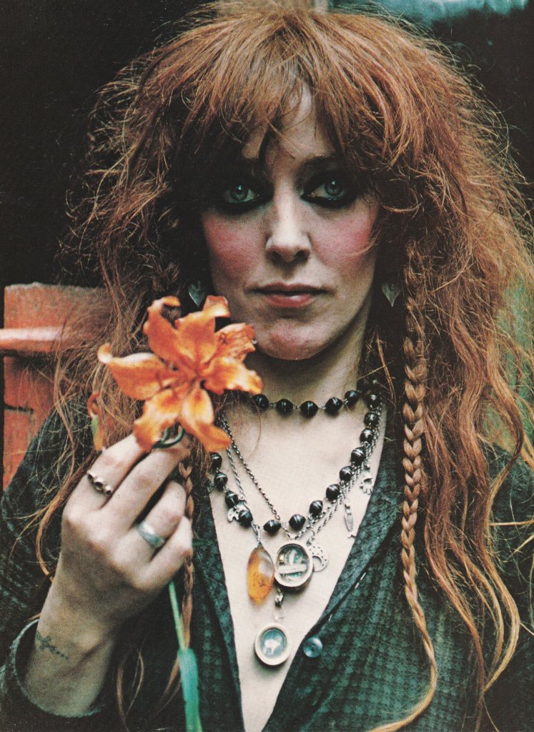
This image really jumped out at me, kindling admiration, attraction, a sense of mystery, a sense of longing for a story. I wanted the story of the fish and the hamsa on her necklace. I wanted a closer look at that tattoo. What was it? In conjunction with the necklace I had guesses: kabbalah? Wicca? The book has an anecdote about this image. Mary had shot several rolls of this lady – Valli – over a few days. On her return home, she loaded the reels in her tank, intending to process them later, and left her apartment. A friend who visited while she was away opened the tanks and ruined most of her rolls. This image was one of the few usable ones from a colour roll. Ah, mystery and chance – an image that averted destruction and endured to affect.
Right then though, the sceptic in me spoke up. “This wouldn’t f***ing work in Black & White.”
I finished the book that afternoon, but the image kept calling to me. I returned to it, and there it was – that sceptical whisper again. The voice had a point. There’s too much orange in the image – her skin tone, the flower, her hair, even the red from her cheeks were reasonably close on my colour wheel. I snapped a quick picture with my phone camera and desaturated it. I was wrong. So wrong.
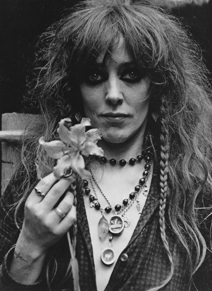
Mary Ellen’s mastery came to the fore. Her use of Depth of Field, with the slight blur on the flower and the intense sharpness of Valli’s eyes, brought out her face. The use of light, albeit diffused, with the sharp reflections from the beads and the jewellery added depth, texture, character. If the colour image kindled infatuation, the black and white one deepened the sense of drama.
So yes, Black and White can work better than colour, because the photographer has other variables – field of view, depth of field, exposure. Exploring this image gave me a sense of Mary Ellen’s mastery of her craft and opened up avenues for me to explore in my own practice of portraiture.
More Monochrome for me. More work on my technique.
